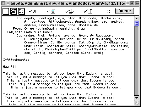
Another reason I love Eudora's human interface is the single scroll bar in the message window. Take a look at a Eudora message window:

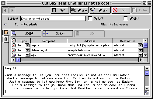
Notice how the various addressing fields expand to fit whatever information they contain and there is a single scroll bar on the right hand side. Now contrast this with a message window from another popular email program (Claris Emailer).

See how Emailer has to use two two scroll bars in the same window to show the same information as Eudora. This has a number of consequences:
All-in-all, this two scroll bar arrangement is significantly less easy to use than Eudora's single scroll bar. It annoys me that virtually all email software that I've seen on the Mac (eg PowerTalk, Cyberdog, Emailer) uses the two scroll bar approach.